Redesigning The Website
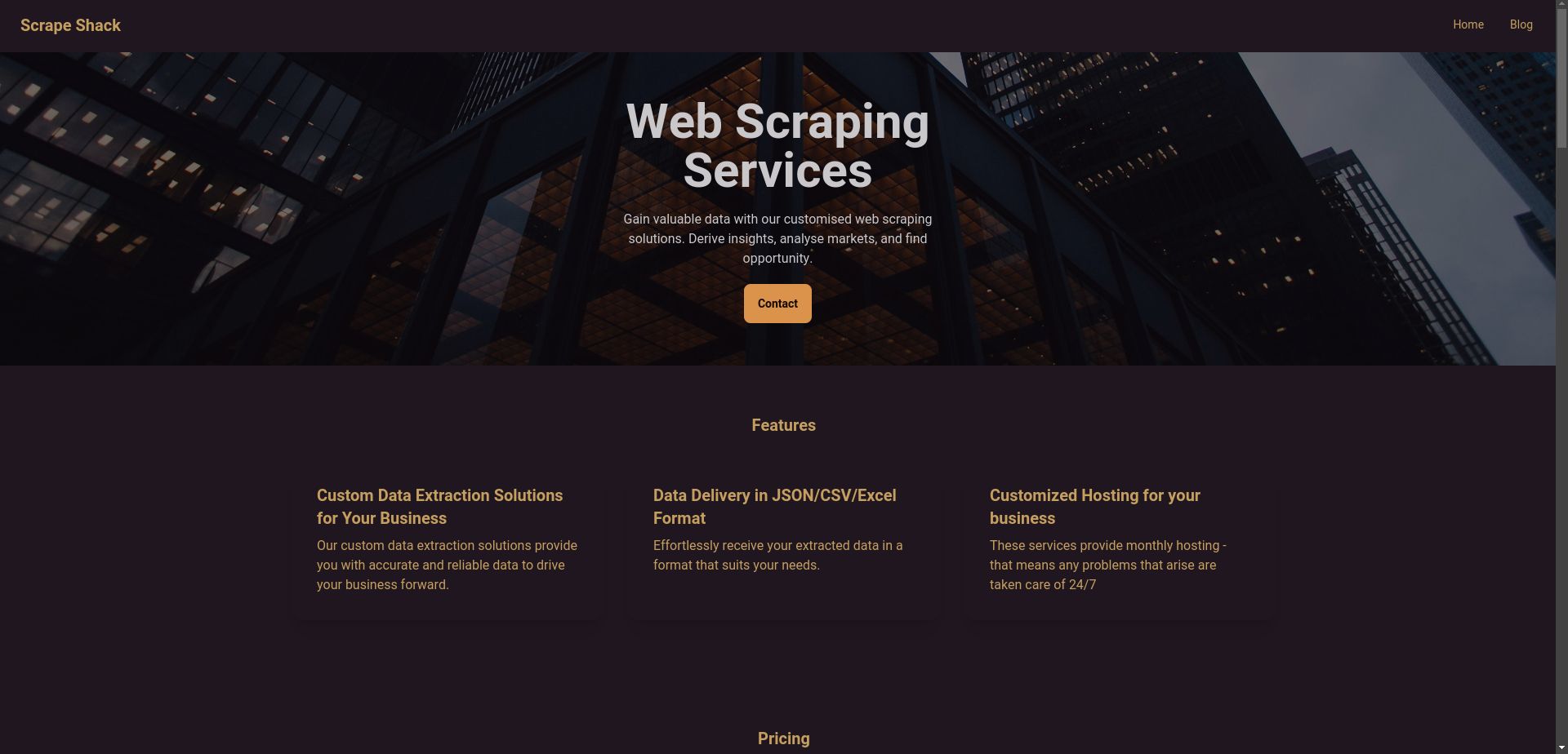
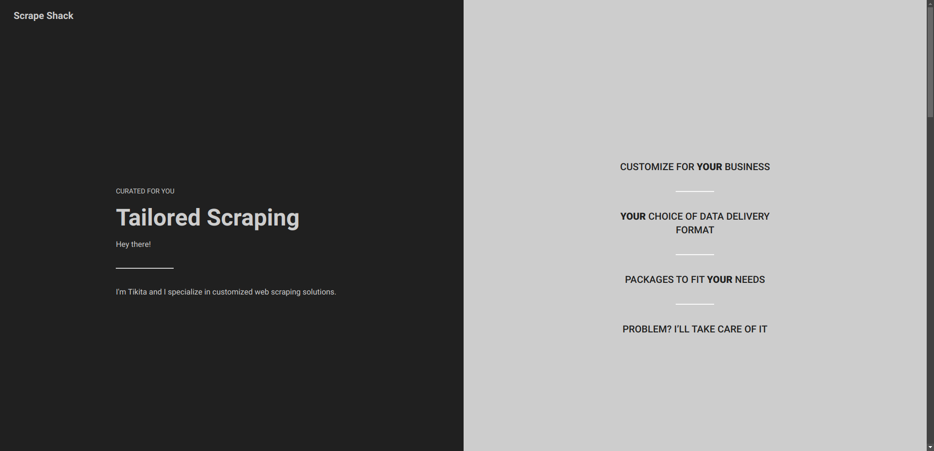
This is a short post about a part of building Scrape Shack. I've been redesigning Scrape Shack lately... I realised it didn't communicate the message of the company correctly. The site starts out as if it's a larger company offering web scraping services, then ends in an 'about me' as a solo freelancer offering the service.
That's just confusing - the message needs to be clear throughout. So I decided I would focus more on the personalised side that I can offer clients: Solutions that are tailored to them. Giving them a larger range of choices for the contract, and making sure it fits their needs. This way I can present the site as a solo freelancer throughout while still coming across as professional.

And another thing… Too much faff = no conversions! On Scrape Shack, I thought it was a good idea to have a section detailing packages and a separate contact form. But this is terrible for conversions! I'm now implementing a buy button and a separate contact form to allow users to have more freedom in the type of job they want done. Overall, I’m very excited about my next release of the redesigned site and the new focus I’m communicating. As a beginner to freelancing, it can sometimes feel like I’m feeling my way in the dark, but I’ve realised that if I just keep doing things, attempting to make an improvement each iteration, i’ll eventually get to where I want to go.